
About product
A leading fitness application featuring an extensive workout library and a built-in social network. Top-3 fitness app in the App Store, with 5M+ downloads on the Play Market. Key markets include Brazil, Russia, and the USA.
My responsibilities
Creation, maintenance, and scaling of a design system
Analysis of user needs and behavior, hypothesis formulation
Designing and prototyping user flows in Figma
Redesign for Apple Watch
Creating designs for A/B and A/B/C testing
Development of marketing landing pages
Website redesign
Limitations
The product was launched in 2014 and has an established audience, predominantly aged 35–40+, with a high proportion of paying users. This factor is taken into account when designing new interfaces and limits the possibility of radical changes. All improvements are introduced gradually and do not disrupt familiar user flows in order to avoid churn among the loyal audience.
The product had long needed a full-fledged design system. Since 2014, the project had grown significantly, making it increasingly difficult to maintain high-quality interfaces: there was no UI kit, no standardized components, typography, or color styles, and auto layout and variables were not used. This led to inconsistent interfaces, layout implementation issues, and slowed down the development of new screens and features.
Solution
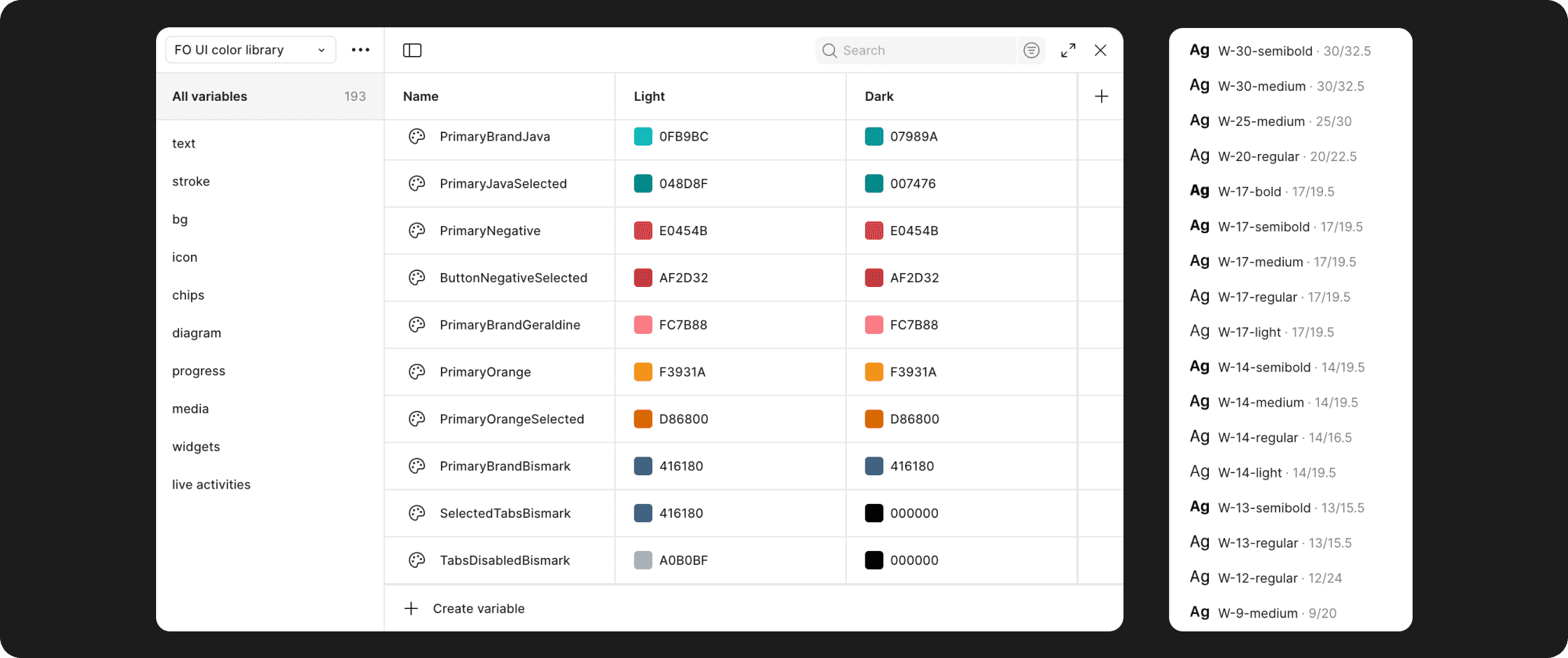
Components и Auto layout — The foundation of the design system and organized layouts lies in components and the proper use of Auto Layout. A component with variables was created for each element, and this approach greatly simplified the creation of new screen layouts while eliminating the possibility of errors when copying elements.
Additionally, all components were redesigned using Auto Layout, which allowed us to fix all issues with spacing and grids. Thanks to Auto Layout, all components became flexible and can easily adapt to any given constraints.


Variables и Styles — As part of working with the design system, variables and styles were introduced. A unified color library was created using variables, since this tool makes it possible to configure both light and dark themes at once without the need for additional plugins. This had a strongly positive impact on the speed of designing new screens. Previously, the dark theme was built separately from the light one, which took an unjustifiably large amount of time. Now the light theme can be switched with a single click and does not require plugin-based add-ons (which can freeze at the most inconvenient moment).
Results
Thanks to the implementation of the design system, the product has seen significant improvements:
Reduced time for developing new screens — thanks to ready-made components and Auto Layout.
Fewer errors and visual inconsistencies — designers and developers work with a unified standard, reducing time spent on design reviews and fixing mistakes.
Improved user experience — thanks to consistent visual logic and design consistency.
Faster A/B testing — components allow for quick assembly and testing of alternative interface versions.
Simplified adaptation for iOS and Android — since all UI solutions are clearly separated.
The UX team focused on improving key product metrics: retention, DAU/MAU, and MAU. During the analysis and solution-finding process, I proposed a new product feature — Year recap. Its first launch in 2023 showed growth in key metrics and confirmed the hypothesis about its value to users. Since then, Year recap has become an annual feature: each year it evolves, adding new, more relevant, and engaging metrics for users.

Results
+5%
DAU/MAU (in absolute values)
+32%
New posts in the app feed during the first week
+3%
New users per month
Templates for training results sharing
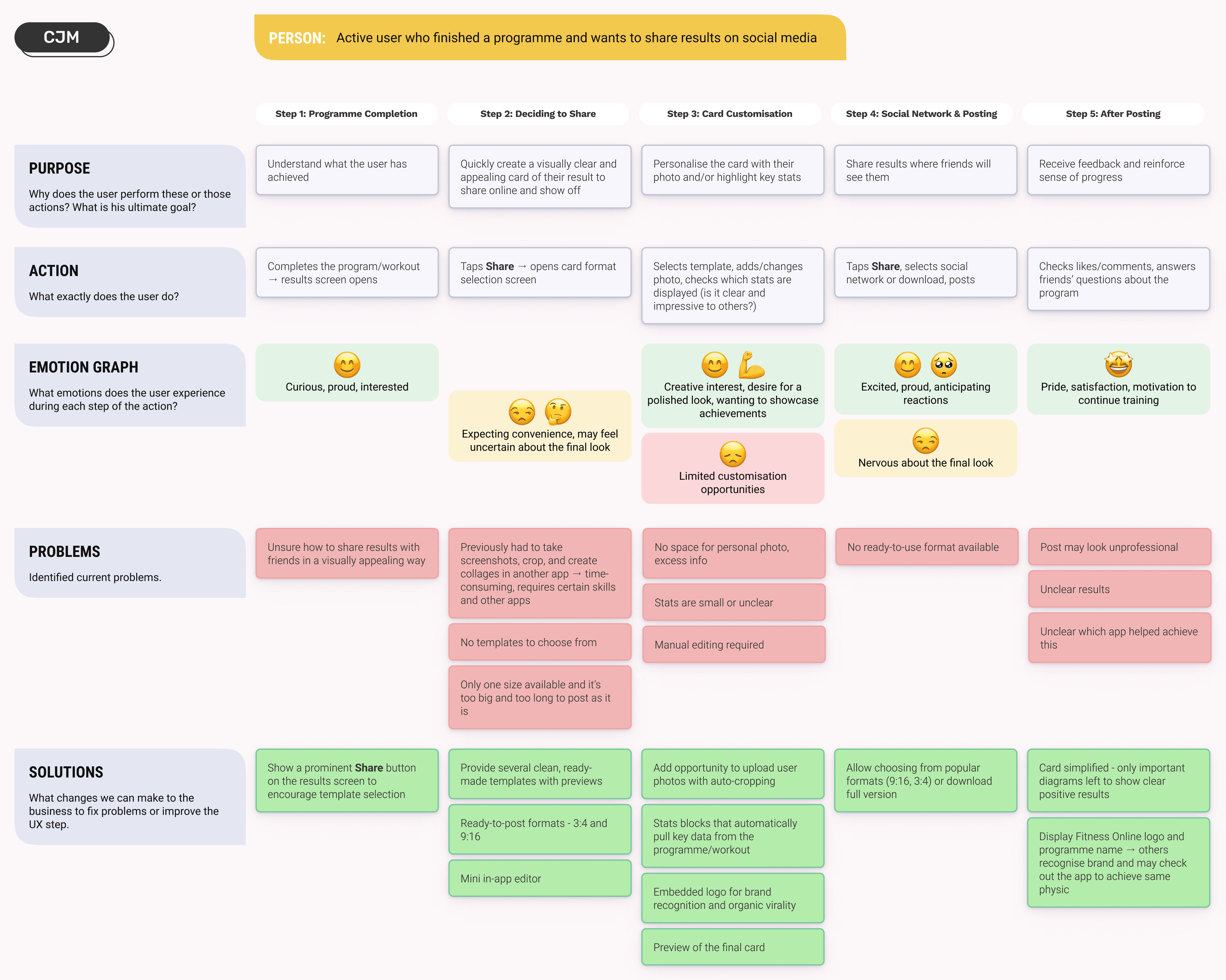
From the UX team, I received compiled analytics on user feedback and behaviour in the “Feed” section. First, the feedback made it clear that users lacked a more convenient and concise way to share their results. Second, it was observed that users actively tried to create their own “templates” for sharing results - essentially a collage of screenshots of existing results combined with a personal photo or simply a cropped screenshot formatted for the feed. I proposed and developed new, user-friendly and visually appealing sharing layouts, which demonstrated excellent results in terms of user engagement.



Results
It is important to note that this feature was tested on 20% of users as part of an A/B test. The control group consisted of users with the old sharing feature. The data below reflects users who had early access to the new feature. After analyzing the collected feedback and making adjustments as needed, the new feature will be rolled out to all users.
+34%
Share rate
+2 p.p.
W4 retention (from 15% to 17% after releasing of the new feature
I developed a design for the Apple Watch with a detailed workout flow. It was important to maintain full functionality despite the strict limitations of the small watch screen. The previous version had been criticised by users for bulky elements and a non-intuitive interface. The screen structure and navigation logic were revised. A/B testing was successful, and the new interface was handed over for development.

The UX team identified user churn during the onboarding stage, when users encountered their first questions about the app’s functionality. Previously, users could contact support, but since all inquiries went to the same channel, the support team was overwhelmed with repetitive questions, and response times were too long.
A quick information search through a chatbot solved this problem. The bot’s capabilities are not limited to text answers, it can also help users manage subscriptions and provide links to relevant in-app resources. This new feature helped reduce the load on support and decreased response times.


Results
-39%
Number of inquiries to operators with repetitive questions
-21%
Average request processing time — support can start handling more complex cases faster, as they no longer spend time on repetitive questions
43%
Requests successfully handled by the bot
I designed new workout widgets that allow users to choose the most suitable content for their needs. The previous version required too many steps to perform the key action — adding a set during a workout — so improving the UX and reducing friction was necessary.
Before:
Widget on the screen → display only
To add a set → unlock phone → open the app → find the button → add set
After:
Widget on the screen → interactive
To add a set → tap the "+" on the widget

Results
+6%
Completion rate of trainings
+29%
Widget usage frequency
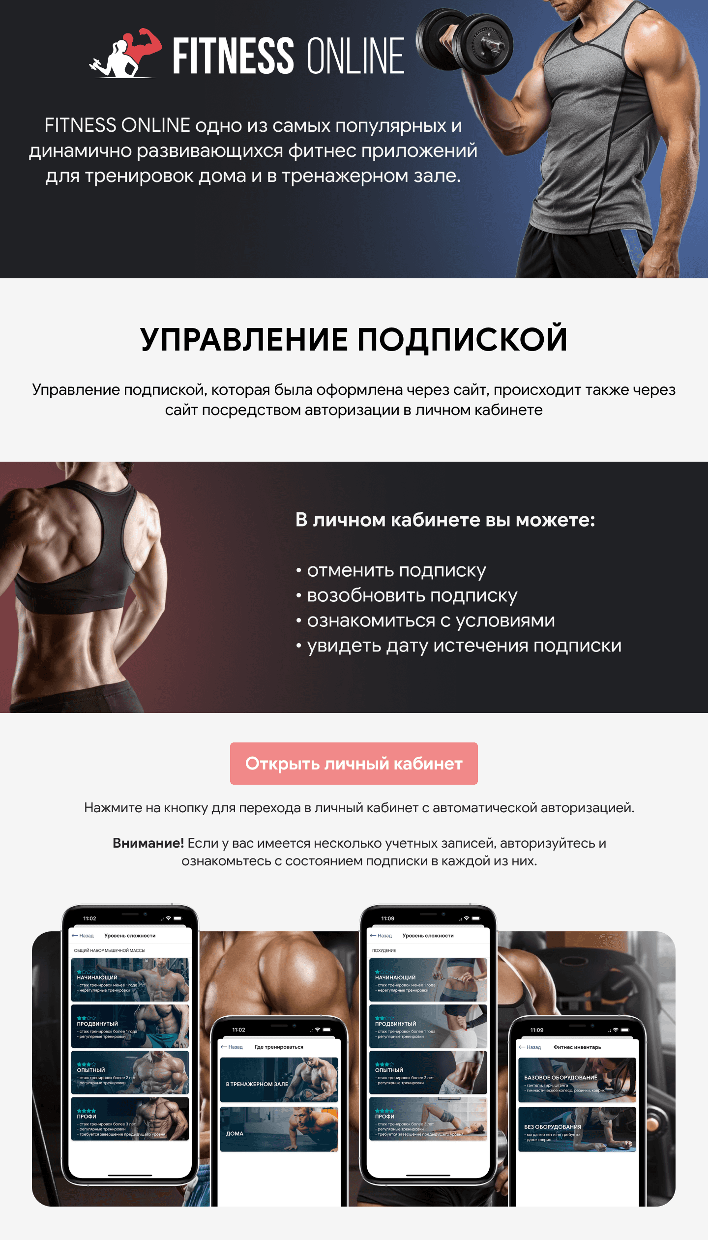
Previous landing pages looked outdated - poor image quality, lots of small text, no emphasis on key information, and unnoticeable buttons. All of this discouraged users and failed to solve their main problem: subscription payment issues. A sharp drop in subscriptions was recorded because of these payment problems. The old landing pages only partially addressed the issue, as not all users were willing to read small, hard-to-read text. The new landing pages improved retention metrics and helped reduce the support workload.
Images of humans were created with AI Recraft

Results
+54%
CTR landing buttons
-38%
Support inquiries related to payment issues
+3 p.p.
Paid users retention